Activism & Governance
MY ROLE AS SR. DESIGNER
Data Analysis
Process Mapping
Data Vis
DESCRIPTION
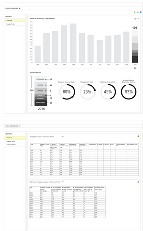
This project was to create an interface for the Activism and Governance application within FactSet’s workstation.After data analysis, the interface displays visualizations for the total number of high impact campaigns along with the breakdown for each year and total number of proxy fights with the breakdown of each year as well. The data spans across a specific industry and sector at a macro level.
STEP ONE:
Data Analysis
For this project I spent time understanding the data and how it relates to each other piece of data within the table. Some questions I asked myself were “Does it total 100?” “What happens if it doesn’t total 100?” “How does this set relate to the next?”.
Asking these questions and then seeing which do and don’t helped in creating visualizations for the data that make sense and tell a bigger story for each category.

STEP TWO:
Wireframes & Data Visualization
Interaction on the charts by clicking on the bar to display the bar’s specific breakdown (color coded). Hover on each color section to show the data value and category that it belongs to. When a bar is clicked, the right side panel will update with specific year data for a more granular breakdown. Sparklines (mini charts) show the 5 year trend as a quick overview.


