Performance Dashboards

MY ROLE AS SR. DESIGNER
Wireframing
UI Design
Data Vis
PROBLEM TO SOLVE
For supply chain management organizations, there is no visibility cross-facility to shed light on inventory, cost savings, and acceptance rate of AI inventory recommendations.
TARGETS & GOALS
-
Enable customers to see a quick overview of cost savings to determine performance
-
Understand the acceptance rate for duplicates and cost savings recommendations
STEP ONE:
Wireframes
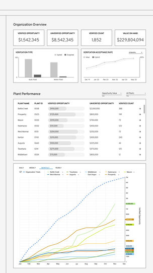
The wireframes plan out the full layout of the main organization level dashboard. The page is broken down into two (2) main sections, Organization Overview and Plant Performance.
Part of the wireframing process included creating new and converting existing data visualizations based on performance data received from our customers.
Interaction and click throughs were planned throughout the page to show more granular detail and specific plant data through progressive disclosure.

STEP TWO:
Visual UI Design
Once wireframes were approved, visual design was applied to all wireframes and pages including both organization and plant dashboards.
Time was also spent creating a charting color scheme that accommodates up to 12 series that also is ADA accessible for the visually impaired.

ACHIEVEMENTS
-
Provided a high-level acceptance rate and cost data for all facilities
-
Spotlight data cards give overall cost and potential savings for entire organization for fast analysis
-
Enabled management to quickly see top and low performing facilities
ADA ACCESSIBLE
Color Theory
All colors chosen are ADA accessible. The image shows all the colors in different types of color blindness allowing every color possible on a chart to be distinguished from each other to keep the charts legible.


